Brand
Identity System
Brand Territory
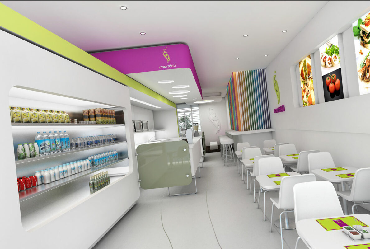
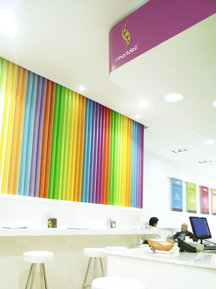
The challenge for the Zone IV agency was to communicate that Smartdeli did not seem like the typical monotonous light food place and already seen in the market, but to focus on that healthy food can also be very rich and attractive.
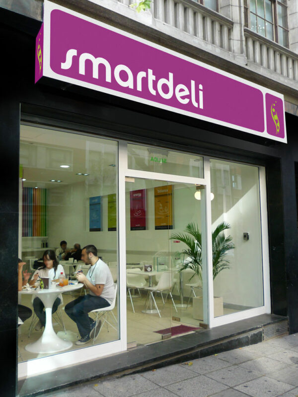
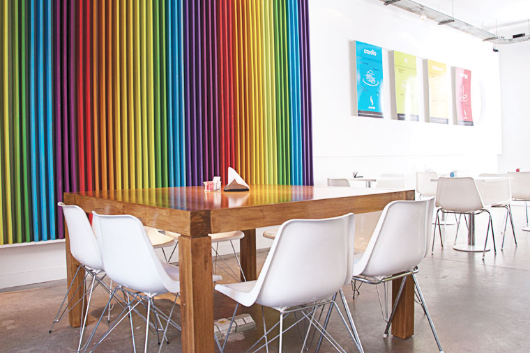
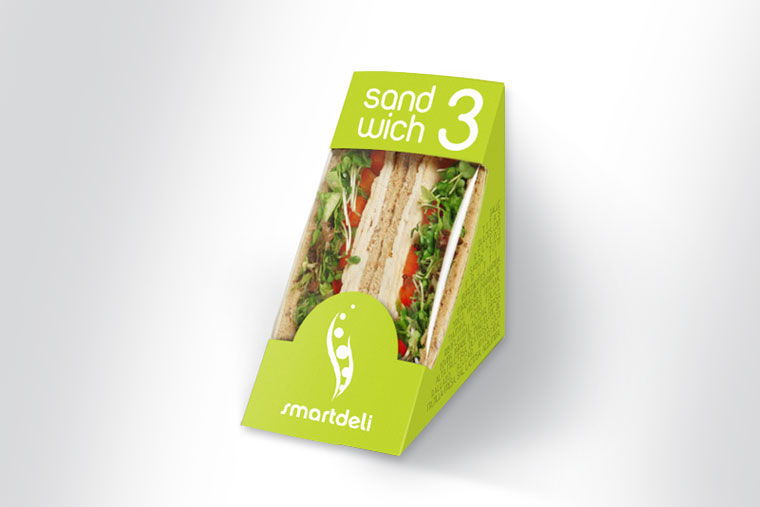
Leading the difference, it was proposed that the brand differentiate itself from the others in all aspects, starting from the choice of colors. We opted for 8 institutional colors we live (violet, lilac, light green, dark green, orange, red, yellow, sky) and white typography, to refer not only to the natural, but also to relaxation and the modern.
With a frame in violet, the name was placed in white and was chosen as logo an ironic chaucha made with soft shapes and curves in light green. The violet color creates a frame to Smartdeli that takes it off the competition, since although it was used the green that refers to the natural, violet generates this dynamic of freshness and modernity.

