BRAND

IDENTITY SYSTEM
BRAND TERRITORY

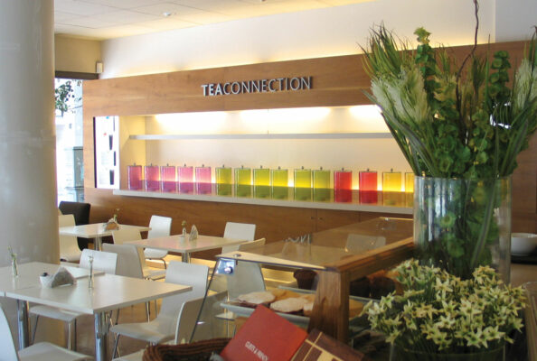
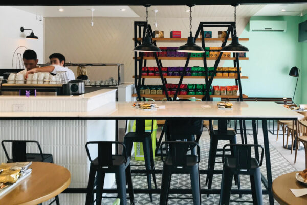
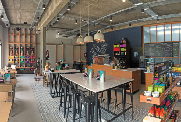
The agency Zona IV was in charge of building Tea Connection’s identity and developing the brand’s retail, which aimed to become a reference in the gastronomy associated with tea, and the different varieties of tea leaves.

The agency focused on designing and highlighting the differential business concept. To do so, it built the brand based on versatility, since it was essential to communicate a flexible image identity, finding its own concept and style. The colors brown and apple green were chosen to symbolize the union of the elements earth and modernity.

ARCHITECTURE

ENVIRONMENT DESIGN
AND RETAIL

For its space, a spirit was created that frames the Core product, Tea, which is exhibited throughout the 360º in minimalist codes, thus giving it a pause, a pleasant moment for the whole day. The white furniture and the whole environment emphasize these concepts, where the brand colors, brown and green, work as strategic accents throughout the proposal.

The color palette of the identity is applied only to the glass bells where we can see and experience the different aromas of the tea blends. In this way we have the product presented in a very nice and prominent way, taking the concept of the old glass candies that attracted the attention of young and old.

This way, together with the customer, we create one of the first gastronomic proposals that achieve the so much sought after concept of “living an experience”.