The Zona IV Agency was called for a new challenge of a 360º design in the city of Santa Fe, for one of the most recognized ice cream brands in the city, Helados Trevi.
Trevi Gelato
GASTRONOMIC SPACE
Conceptual definition of the creative proposal, its values and its axes of communication, positioning, Branding design, Brand, Brand Territory, Identity System, Packaging and Architecture of the commercial space for the Chain.


BRAND
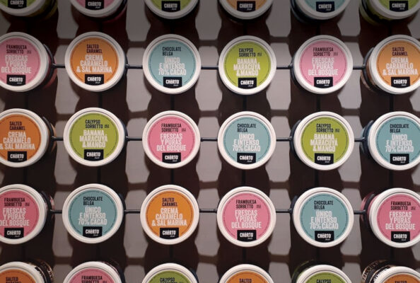
IDENTITY SYSTEM
BRAND TERRITORY
The agency’s strategy was to recover the DNA of the brand’s origins, where the Italian flavors of its ice cream and its identity were the basis of its beginnings. For this, the Italian design codes were recovered, as well as the characteristics of the Fontana di Trevi in the city of Rome, which gives the name to the chain. At the brand level, we achieved a stripped down and simple typography, accompanied by its Gelato dry-brushed typeface with a slight movement of the letters, giving it dynamism and playful codes typical of the category. We worked on an icon that synthetically recovers the figure of the Fontana horses, creating a solid design that gives a great character to the whole identity.

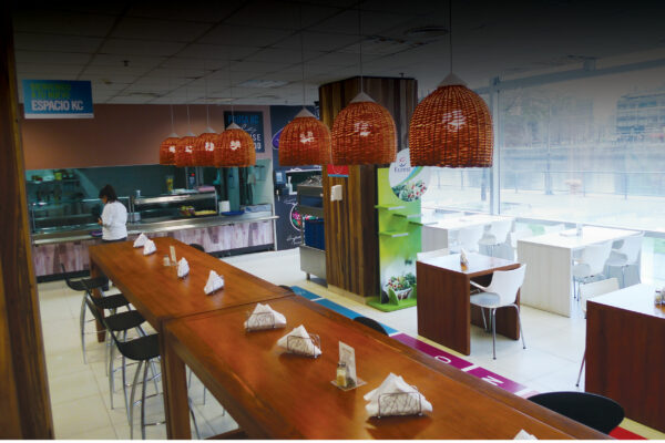
ARCHITECTURE
ENVIRONMENT and RETAIL DESIGN
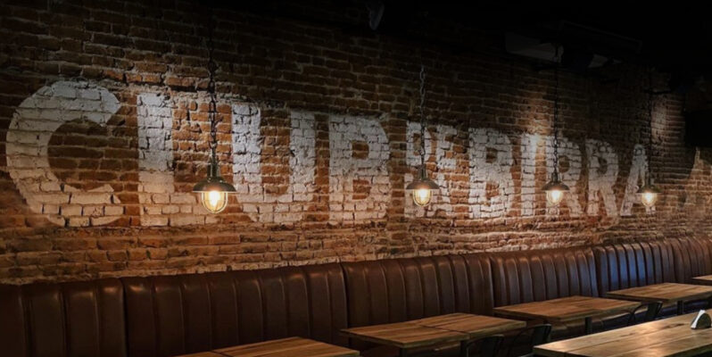
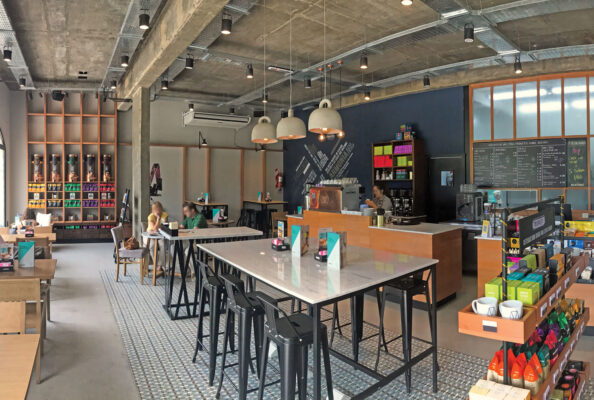
The approach of the architectural design project is aligned with the concepts defined in the initial creative search, taking the wefts and textures, so classic in Italian design, as a container for the premises. We worked with different materials, wood, iron and limestone to complete the desired character.
In this way a 360º design is achieved with a rich combination of weaves, materials and color palette that gives originality and identity to the new proposal of Trevi Gelato, with the intensity of Italian design.

In one of these sectors, we find a fun carousel, reaffirming the “Trevi’s horse” as part of its brand, consolidating Trevi under the concept of Italianity and its playful side towards children who are a great inspiration for the brand.
In this way, Trevi’s proposal is being established among the great competitors in the city of Santa Fe.