The agency was called by Western Union to redesign its new stores and create its new branding. A 360º design with great challenges for a chain of more than 6000 stores throughout the country, where the Western Union and Pago Fácil brands had to coexist in an integrated and linked way in a new architecture that allows the presence of their brand spaces in a solid and modern way. For this, we worked on their positioning, new color palettes and a new materiality such as wood for their new retail design.
COMMERCIAL SPACE
360º Design: Conceptual definition of the creative proposal, its values and communication axes, positioning, Branding design, Brand Territory, Identity System and Architecture of the commercial space for the Chain in its different formats.
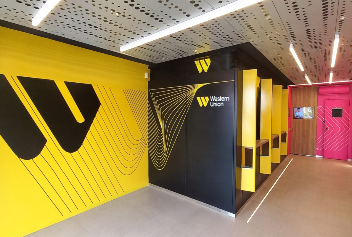
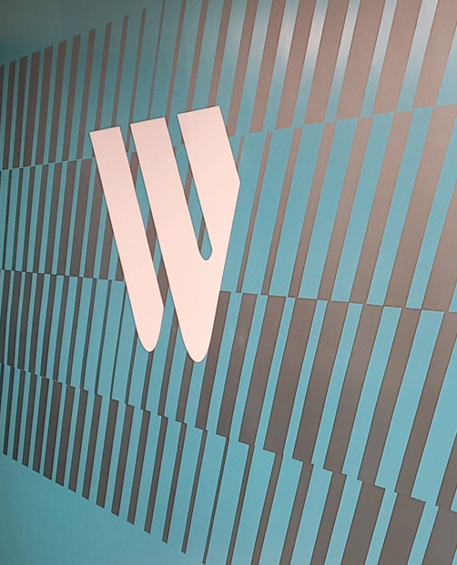
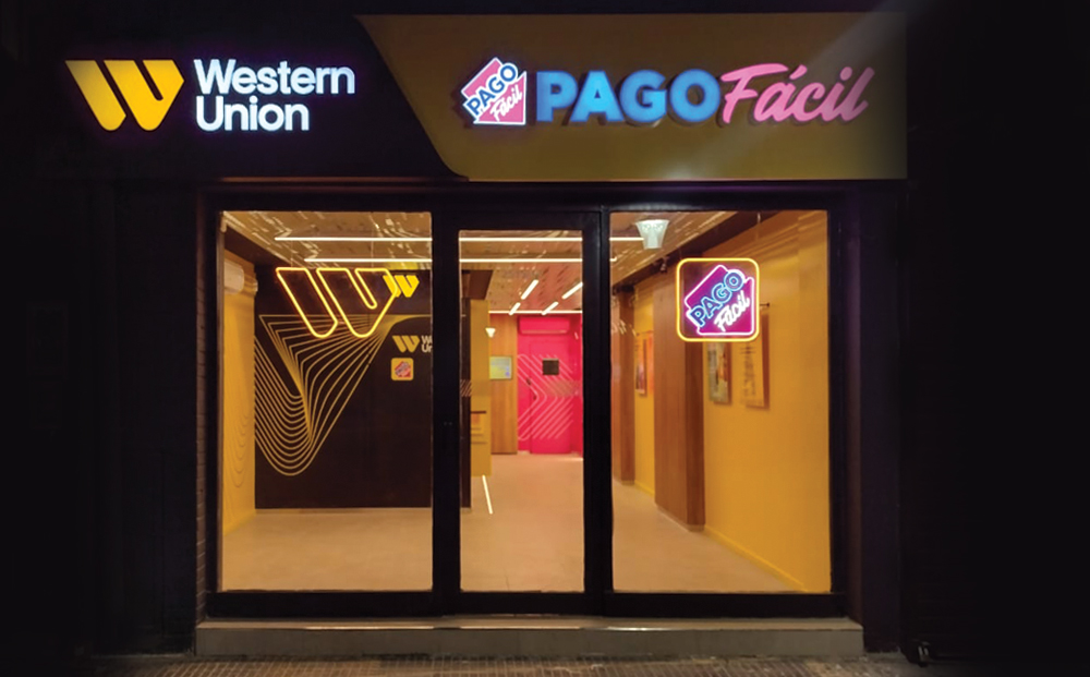
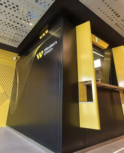
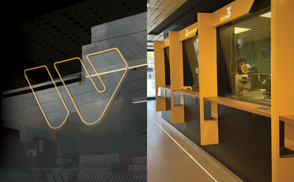
We also worked on the industrial design of the bunker, giving it greater presence, new colors, shapes and textures. The new yellow pieces that separate the boxes were designed in a solid and simple way, where their shapes are born from the Western Union brand, consolidating its new branding.
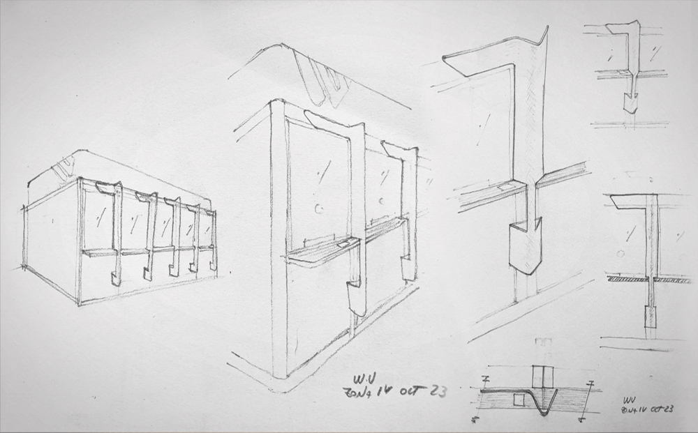
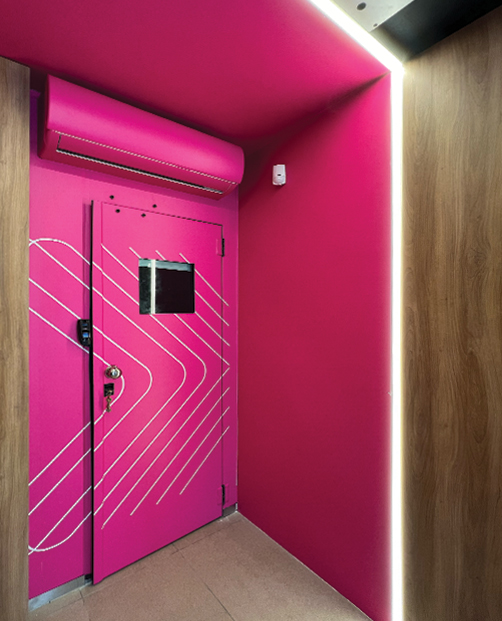
For this store we worked with a special lighting of neon lights and brands highlighted with punctual lighting for each identity, reinforcing the modern and current character from the graphics and architecture. The lighting slits allow to enhance the different spaces where the colors yellow, black, magenta and turquoise, along with wood coexist and define the new palette proposed by the agency. A design that manages to solve the multiple challenges posed by the client in a practical and coherent way with the concepts of both brands.
