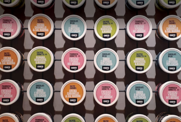
Packaging
Line Design
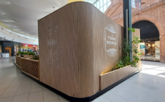
For the line of its new product, a fresh color palette was thought that would play in all the packaging, with a brown base color that enhances and unifies all the pieces, working in conjunction with the brick that was proposed for the design of the architecture of the shops.